Sunday, 1 December 2013

Knock Shops..

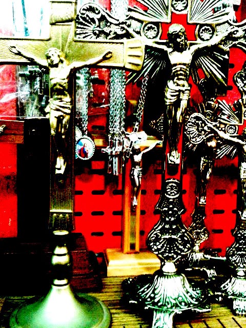
When i decided to focus on the materialistic side of religion, I used the photos taken in shops in Knock and displayed them as purely that - just photographs where the levels of contrast were altered slightly.



From these, I then decided to draw the images so that my project still had its drawing element that I had wanted at the very beginning.  I chose a different more abstract style to draw these which I found quite freeing and less frustrating than trying to draw an image that was perfect.  At first I drew them photo size, about 6x4 with some being a tad smaller.  But then with some encouragement I decided to go bigger, up to A1 size using a projector which I found really enjoyable and I loved the end result.


I also started to incorporate text into these images, as well as turning one into a woodblock and printing it, just to start off and bring an element of print into my work.

Woodcut


As well as these drawings, I also started a series of shop fronts which are simple line drawings.  My original intention was to incorporate some collage art into the windows of them but I really liked how they looked as just line drawings and in a series.  So instead I've decided to just keep them as they are and have a very clever title over them, a title I have yet to think of but I'll have it come assessment time ;)


Shur the bant was mighty in Knock..

I decided I needed to broaden my research for my project and when I heard that the mother was going off to Knock for the day, I tagged along! Checking in at "Knock Shrine" on Facebook got some hilarious reactions as people told me not to burn, burst into flames etc.  The trip was well worth it though as it helped me get some clear ideas for my project and where I wanted it to go...and also made me realise what a nice place Knock actually is.

Some of the pictures sneakily taken around Knock :P


From these, I decided to put them into Photoshop to edit them and attach passages and quotes which I found of interest in the Bible....quotes which I thought were in someways controversial.


As with all religious places and attractions, there was of course an abundance of shops and stalls selling religious souvenirs, sticks of rock, cards etc. which were what caught my attention most.  One quote from the Bible reads "You cannot serve both God and money"..something which made me think as one of the most widely agreed opinions on the Catholic Church is its hunger and greed when it comes to wealth.  Therefore I decided to focus in on that particular aspect for the next phase of my project.

Monday, 21 October 2013

Joy of Progress Reviews..

So after a tutorial with the lovely Breda, I decided to go away from pen ever so slightly and use graphite instead.  These take a lot longer than pen for me so a lot more work went into them.

I visited the Biennale in Venice earlier in September and came home inspired by some of the art work I saw there.  One such way of displaying the work really caught my eye.  There was a blank piece of paper in one of the exhibitions at the Arsenale, with a mirror behind it so that you could only see what was printed on the paper if you looked in the mirror.  I really wanted to give this a try and felt it would work well in my project.


Next time though when I attempt it again, I hope to go bigger and have the drawing more widely spaced out from the mirror.
 
 
I also wanted to base drawings and pieces of work on the 10 commandments as well.


This project has a lot of play on words and contradicting text with images, as seen with my Pope Francis "See No Evil, Hear No Evil, Speak No Evil."


Breda also pointed me in the direction of a documentary called "Silence in the House of God."  On seeing that it was 2 hours long and dealt with the issues of the child sex abuse scandals in the church, I thought not a hope would I watch the whole thing, id just get the gist of it.
 
But alas on sitting down and beginning to watch it I was immediately sucked in.  It was tough in parts to watch as the subject matter was quite sad but it was an amazing documentary that was so well put together.  I wanted to touch on the subject of the scandals but its not an area I would be willing to make a joke about like I do with the other areas of the Catholic Church....I do have some morals after all :P
 
In the documentary, the boys who are now fully grown men, refer to the priest who abused them as a wolf, a wolf who would creep into their rooms at night looking for their prey.  This gave me an idea of using an image of a wolf as a metaphor for the priest.  Personally I think it would make a good etching which is my next port of call.
 
I want to mix etchings with screen prints, etch the pen drawings as I feel they would work well, and then screen the words over them.  Once I can start back into the whole print room madness, I'll be happy!


Hello 3rd Year!

So back into the crazy busy world of art college for another year!  Just when I thought Print couldn't get anymore hectic, 3rd year proves me wrong.

For this year, I'm continuing with my religion theme and focusing on the Catholic Church once again.  Last year I felt I didn't get what I wanted out of it, so this year will be different!

To begin with I decided to do a drawing based project.  I came to art college because I love to draw but sadly, I have ended up not drawing the way I like since I started.  So I've been having some fun drawing my holy images in the way I like.


I started with pen drawings as I have an obsession with drawing with biro, always have.  I created my own little happy creepy looking priest who will be the basis for a lot of my drawings.  I decided to incorporate David Godbold's way of doing his art work.  He uses tracing paper to make layers of drawing on text. 


I started an online survey which is where I got a lot of my ideas for my drawings from.  Majority of people had a very negative view and opinion of the church so I decided to show both sides of the argument.  I wanted to show how the church was seen long ago to how its seen now hence the drawing of the nun.  I also was taking bible quotes and quotes from church teachings and contrasting them with images underneath.


A lot of people spoke about how they have their direct line to God and don't feel the need to go through the priest anymore in todays society so as one of the first tracing paper drawings, the line going directly over the priest to the holy heavenly hand above seemed like a good way to show this.

Monday, 13 May 2013

Stop Motion Popes

So I decided to attempt to do a stop motion as well as part of my project.  I did a lot of them in first year using clay figures and cut outs so for this one I decided to attempt a drawing stop motion.

No one told me just how hard these are to make.

Every scene had to be drawn individually, then photographed and put together.

423 photos later, it was FINALLY ready to be put together.

Its rough and not very professional but pretty happy with having actually achieving it :)

Link for it on "The YouTube" :)

http://www.youtube.com/watch?v=VLrxhopON5A


I can see the finish line..


For the prints of the twitter speech box I decided to do some on Photoshop aswel.  Now I am plain useless when it comes to technology, especially Photoshop so its very basic what I've done.


Aswel as this, I was also working on a reduction woodcut which has 5 colours altogether.


Attempting to make brown!

Managed it :D 

With 3 colours done


All inked up, ready to go


With 4 colours
Next thing to do is black and then I'm pretty much done :)